Black or Bold? Choosing the Right Colour for Your Heritage Project
March 11, 2026
By Scott HIlton
Choosing a heritage-style renovation isn’t just about frames and glazing — colour plays a huge role in how confident you feel about your decision.
And this is where many homeowners pause.
Black feels safe. Colour feels exciting… but risky.
So how do you choose without worrying you’ll regret it in a few years?
Let’s break it down properly — including why Textured Black has become one of the smartest “play it safe” upgrades, and when softer or bolder colours genuinely work beautifully.
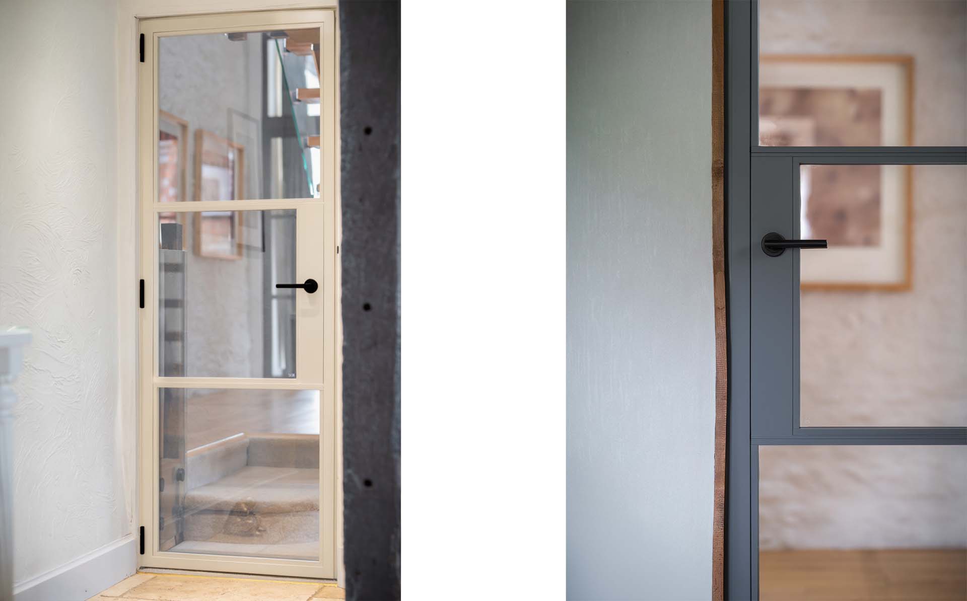
Why Black Still Feels Like the Safest Choice
Black heritage doors remain popular for a reason — they suit almost every architectural style. Black:
Complements most brick, stone, and render finishes
Feels timeless rather than trend-led
Works on both period homes and modern extensions
Feels reassuring when longevity and resale value matter
This is why black is still the most commonly specified colour across heritage-style internal and external doors, but not all black finishes feel the same.
Why Textured Black Is a Smarter Upgrade
This is exactly why we’ve recently added Textured Black to our stock colour range for the internal range.
Textured Black keeps everything people love about black — but adds depth, softness, and durability.
Why homeowners are choosing Textured Black:
A subtle texture that reduces glare and reflection
Adds richness and shadow to slim heritage frames
Feels more architectural and premium
Hides fingerprints, marks, and everyday wear far better than smooth finishes
Works equally well on heritage-style internal doors and external aluminium systems
For customers browsing our Internal Door range, Textured Black has quickly become the confident “yes” option.
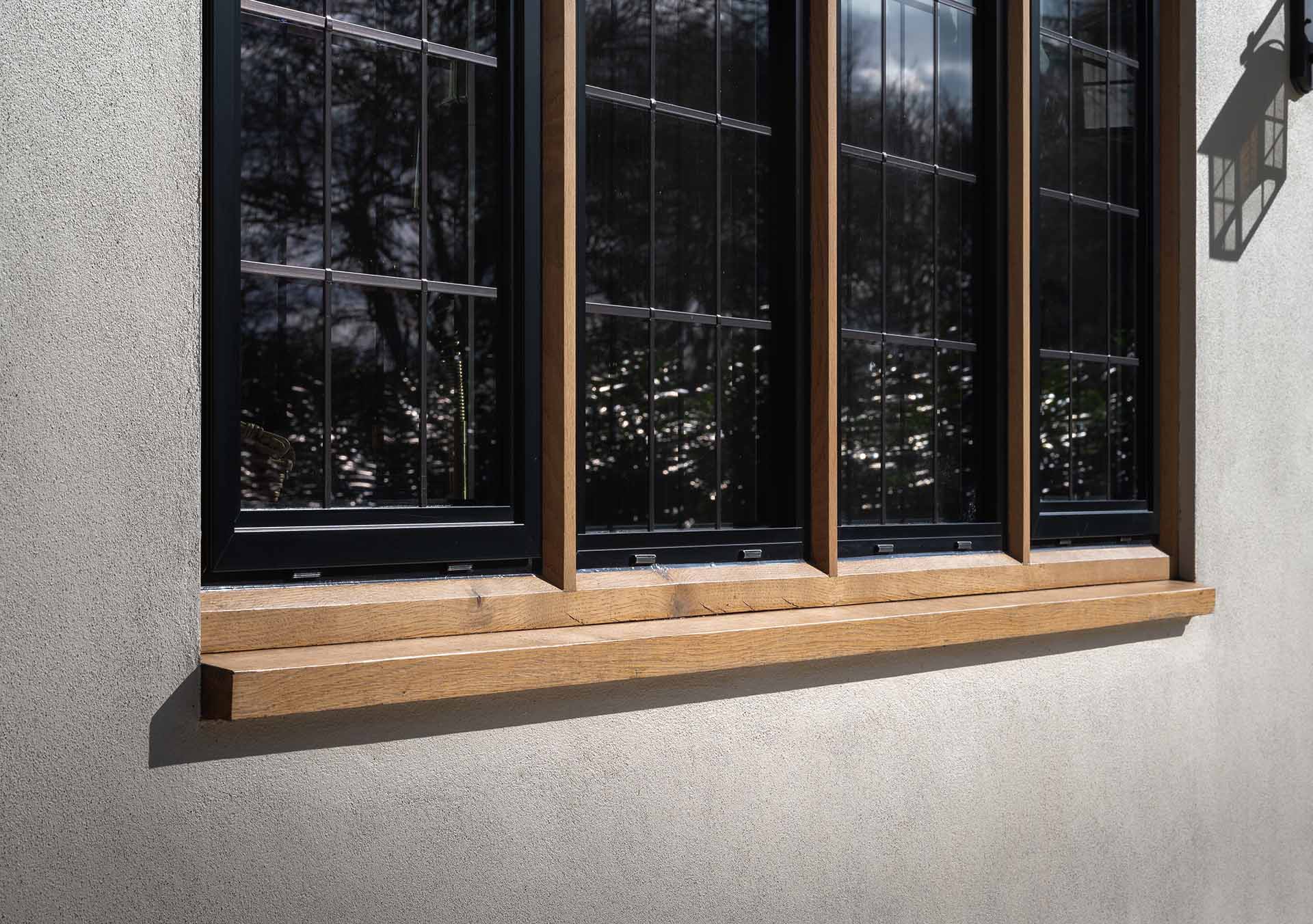
When Softer, Muted Colours Make Sense
Muted tones — particularly greys and greens — are a popular choice for heritage designs because they soften the look without dating the property.
These colours work well when:
Black feels slightly too strong
You want contrast without boldness
The property has softer brick or stonework
The door is on a rear or garden elevation
A good example is RAL 7032 – Pebble Grey, which is frequently chosen because it:
Feels lighter and warmer than black
Sits comfortably in both period and modern settings
Pairs beautifully with slim heritage frames and clear glazing
Muted colours add warmth and character while still respecting traditional architecture. They’re particularly well suited to renovated cottages and farmhouse properties, where frames should complement natural stone, brick, or render rather than dominate them. When used on external heritage doors and external heritage windows, these softer tones create a finish that feels authentic, considered, and timeless.
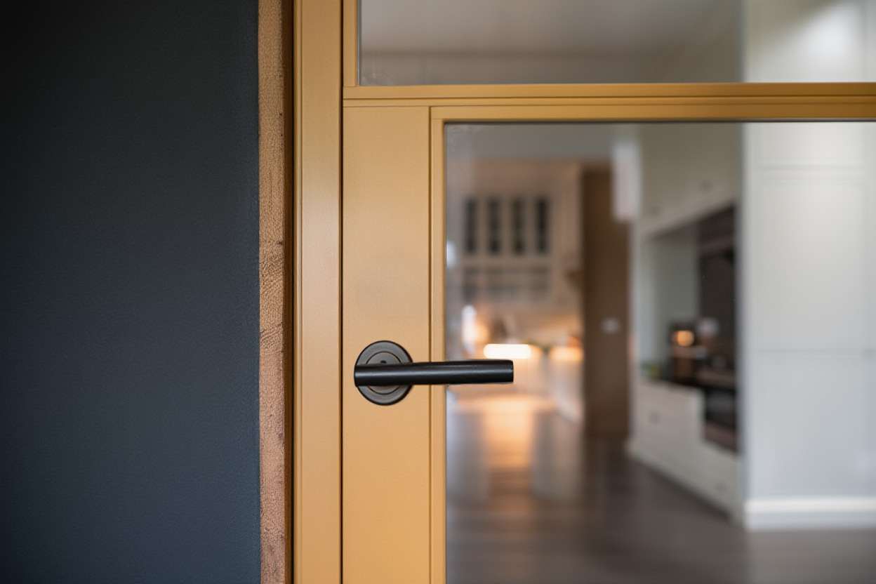
When It’s Okay to Be Bold (And Why It Works)
Then there are moments where playing it safe actually undersells the design. One colour that consistently stops people in their tracks is Gold pearl — a warm, brass-like metallic finish that brings genuine character.
We showcased gold pearl on heritage doors at a recent trade show, and the reaction was immediate:
Architects loved the warmth
Installers saw it as a premium upgrade
Homeowners saw it as a statement without being flashy
Gold Pearl works particularly well:
On internal heritage doors
In loft-style or industrial-inspired spaces
In modern extensions where black feels expected
It’s not about being loud — it’s about being intentional.
The Finish Matters as Much as the Colour
A final point people often overlook: Finish quality is what makes a colour age well.
Things that matter:
Textured finishes soften harsh light
Powder coating quality affects durability
Internal and external colours don’t have to match
Slim heritage frames benefit from finishes with depth
This is why colour should always be considered alongside the system itself
So… Black or Bold?
Black remains a classic for good reason. Muted greys and greens offer softness without risk. Bold colours like Gold Pearl adds warmth and confidence where the space allows.
For many homeowners, Textured Black sits perfectly in the middle — safe, timeless, but elevated.
It’s not about avoiding colour. It’s about choosing one that feels right for your home.
Need Help Deciding?
If you’re choosing between black, Textured Black, muted greys or greens, or something more distinctive like Golden Beach, a short conversation often removes the doubt.
We regularly help homeowners compare colours side by side. If you'd like to see the finish in person, feel free to get in touch and request a free colour swatch.
Contact ushere to request your free swatch and choose with confidence.

%203.jpg)